This is my magazine draft. I have incorporated the same image from my CD cover as I want all my designs to flow into one and have the same promotion. If i added in a different design from my CD cover, then my audience wouldn't know the product i am promoting. I have added a short message at the bottom of the page as if the advert was signed by our artist 'Distinct'. This is a hint into our music video as the message is addressed to 'Taylor', whom the song is based around.
Tuesday, 24 October 2017
CD Digipak Template - Draft
This is my first draft of my CD Digipak. I have added in the main image onto the CD inner as most CD covers I have viewed have done the same thing. On my back cover, I have included the barcode but this is something I might remove as it doesn't fit in with the design. This is because I like the design being simple and straight down the middle. For my CD, I have included one side being a musty blue next to a grey with the writing of the album on the top. I feel my Digipak would appeal to a Hip hop audience between the ages of 16 and 25.
Saturday, 21 October 2017
CD Cover - Draft
This is my draft for my CD cover. I have gone with the wet paint idea as if the paint has dripped down and dried up. I have also taken into consideration the layout of my cover. This includes me keeping to a four quadrant grid and keeping everything down the middle so it is nice and symmetrical. I believe my CD cover will attract my target audience as it simple and effective. It is also aesthetically pleasing to other genres like indie.
Friday, 20 October 2017
CD Back Cover - Draft
This is my back cover for my draft. This is similar to what my finished product is going to look like. I might space out the the writing so it isn't as close as it is at the moment. I am not going to add a barcode as i dont think it is going to suit the look, But, if i find a barcode that will look nice and stylistic, then i will keep it. I also need to add legal writing onto my back cover. This will probably be in the bottom right or left corner of the back cover.
Wednesday, 18 October 2017
Photoshop - CD Cover Idea
This is one idea i have had for my CD Cover. I feel that this is stylistically pleasing, and that money and the golden watch both link into the Hip-hop genre. I like the use of the dusty, green background as it gives off this old, unused vibe which i think works nicely with the old stack of money and the faded folded watch. The title i used for the design was 'Time is Money.' This is just a play on title used as the watch (Time) is sitting on the pile of money.
Photoshop - CD Cover Polaroid Idea
This is one design i have had for my album. This is a Polaroid design that i put a tear through. i feel that this can have multiple effects and meanings. This design was actually really easy to make as i just overlay a Polaroid template and change the blend mode. To make this design, i got a Polaroid template off google along side a simple frame. I then placed the image inside the frame with a clipping mask and then placed over it the Polaroid template. I then changed the blending mode to 'overlay.' I then added a hue saturation and clipping masked it to the Polaroid to make the image look older than it is. I then turned this into one image and hid the layers. i then downloaded a tear effect on google for the 'paint brush.' I then applied a layer mask to the image and put it on white. I then placed the paint brush (with the tear brush selected) on black and pressed the tear across the images face. I then selected each broken part and filled each one with white to create the white rip.
Saturday, 14 October 2017
Tuesday, 10 October 2017
Monday, 9 October 2017
Sunday, 8 October 2017
Saturday, 7 October 2017
Magazine Advert Analysis 1 - Ed Sheeran
This is my magazine analysis for Ed Sheeran. I will be incorporating some of the ideas into my own final magazine advert.
Friday, 6 October 2017
Thursday, 5 October 2017
CD Cover Production - Photoshop Ideas
For my CD cover, I am hoping to have a wet paint effect, but with part of it being black and white and another part being colored. This is because i think the contrast between the two is going to look really cool, adding an extra effect onto the picture which makes it stand out to my audience.
To do this, I looked at various Photoshop tutorials on YouTube and watched how they de-saturated part of the image and then saturated the other half.
Wednesday, 4 October 2017
Changing Our Idea To A Performance Based Video
- After intense thought, my group have decided to not go with a narrative structure for our video. As our story is too complex and hard to make, it will be easier to just go with a primarily performance based video. this way, we can include some of the shots we want but also to save time. We also think that if we carry on going with the narrative structure, we will need to re-shoot a lot of our shots.
We are going to change a lot of our shots as we believe they could be much better. We are going to change the outside location and keep the white room location. This is because we believe the outside location does not fit our genre. We really like having the white room in our video but we are thinking of changing the framing of the video. Also, a lot of the white room shots are corrupt and there seems to be problems with the quality of the video. We also want to add in two new locations. One is where we have a mock-up recording booth. To do this we are going to need a microphone which fits the music genre. We are also going to need a blank white room so this shot will probably be recorded in the white room. We are going to add a shot of our artist (me) in a homely environment with him singing on the sofa. We also might include a shot where the camera is positioned inside, whereas the main artist is inside.
Whilst thinking about what we can include in the chorus, we decided to add another artist to sing the part to make it more realistic. We are also going to include multiple shots of us together.
Tuesday, 3 October 2017
Music Pitch Feedback
This is the music pitch feedback that my group received. We will be taking on board some of these notes but will mainly focus on our own ambitions. However, as most of the comments we revived are good, there inst much need to change the design of our artist or change the song. They likes what we had to offer and liked the controversial idea of having the video in black and white.
Song Lyrics Analysis
For our music video, we have decided to go for a Narrative structure to emphasis the songs lyrics. To decide which scene went where, we de-constructed the lyrics and thought up scenes to match the lyrics.
Storyboard Animatic - Moment of Silence
This is the storyboard animatic for our final video. This is synced with the song in the background. Isabel Denney-Foster created the storyboard with inputs from me and frank about what we should have in each shot. At the moment, we have decided to go with a narrative structure for out video but this could change as our story is challenging and complex to do. It could also cause some ethical issues when making it. This is why we might swap it to a primarily performance based video.
CD Digipak Designs


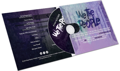
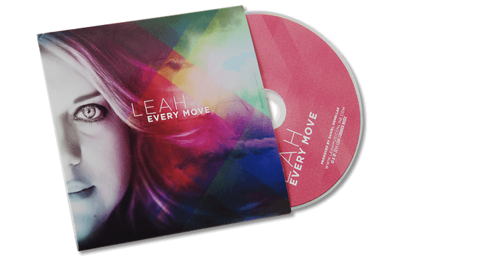
These are some designs i have been intrigued by whilst looking through Digipak designs. I love the faint use of the wet paint on the top design used on the inside cover. that is something that i might use in my design. I also like the use of having my face on the cover as seen in the second one. This is because as i am a small artist, i would not be recognized as much as bigger artists. I love the use of the screen glare Photoshop in the bottom design. This is because it fades into the other half of the Digipak.
CD Cover Designs


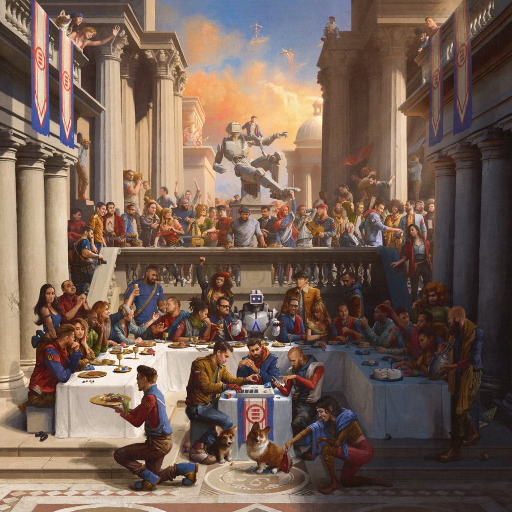
These are various CD Covers that have intrigued me over the Hip-hop genre. I love the tear that has been used in Witt Lowrys Cover 'I could not plan this.' I love the simplicity of Kindest Regards, also by Witt Lowry. This just contains an image, text and the advisory sticker. The Logic albums are very nice. I love the complexity of photoshop which has gone into them. I love 'Under Pressure' which contains graffiti and looks very pleasing for the eye. Eminem's album is also very simple but also funny. I love how he is chained up which connotes to his album as being portrayed as an animal by the media.
Subscribe to:
Comments (Atom)
Note To Examiner
Dear Examiner I hope you enjoy looking through the last year of my A2 media coursework. This blog contains my research and planning, draft...
-
This is my final edit of my CD Digipak. I have now incorporated the big letter 'D' into my CD inner cover from my magazine adve...
-
This is my final version of the back of my CD cover. I have added in small legal writing at the bottom. I haven't changed much of the...
-
We have now got all of the shots and are now editing our video's individually. I have planned that my video is going to have an old filt...


